- Home
- Inspiration
- Learn Design
- Color Theory in Your Home | Design & Ideas from LL Flooring
Color Theory in Your Home | Design & Ideas from LL Flooring
Colors. Selecting a color palette for a room’s design can be one the most challenging, stressful components of the design process, but if you choose wisely and are open to taking some risks, it can be immensely rewarding. No matter what the project entails, basic color theory is always a good place to start.
Though many of us are introduced to the color wheel at an early age, some might not understand its significance beyond being nice to look at. When it comes to interior design it’s a classic, timeless tool that will come in handy time and time again. Here, we’ll break down the basic elements of color theory and how to use it to your advantage in your home to create visually appealing spaces that play with your style.
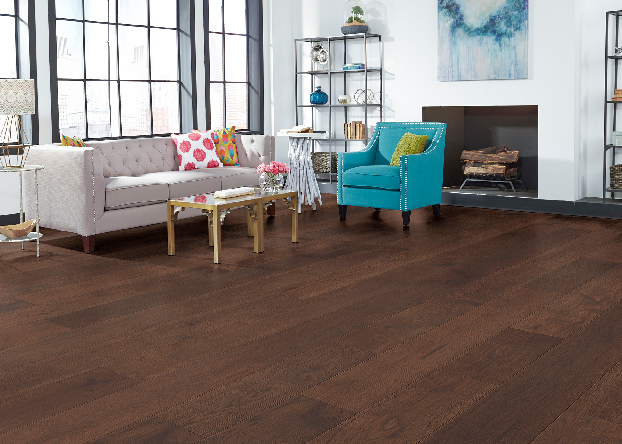
7mm+pad Lake Superior Hickory Water-Resistant Distressed Engineered Hardwood Flooring 7.48 in. Wide
Color Theory 101
The full color wheel can be broken down into three parts: primary, secondary, and tertiary colors. The three primary colors of red, blue, and yellow cannot be produced with mixtures of any other shades, and their combinations build all other colors on the wheel. Secondary colors of green, orange, and purple are created directly from combinations of primary colors, and tertiary colors of yellow-orange, red-orange, red-purple, blue-purple, blue-green & yellow-green are combinations of secondary colors.
Pretty simple, right?
But when you start looking at how each of these shades play with and against one another, unlimited opportunities are unlocked. Obviously, there are endless shades beyond the tertiary colors found on the wheel, but once you have a solid understanding of color families and how they work with one another, the options are endless. You can experiment with hues using an online color picker and even generate color codes for the shades you like.
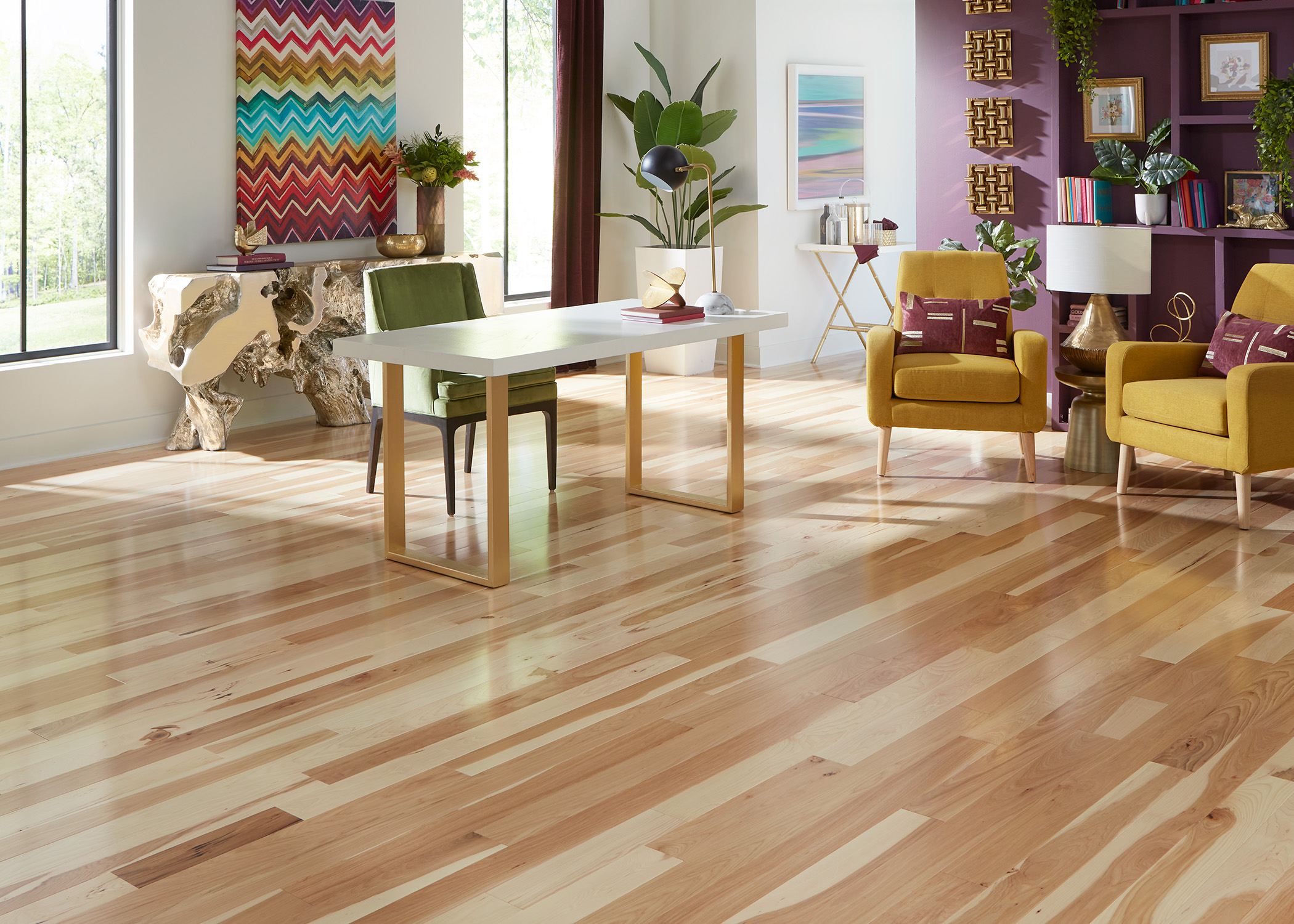
3/4 in. Natural Hickory Solid Hardwood Flooring 4 in. Wide
The Rules
Color theory seems rudimentary, but it’s tied to the way our brain perceives its surroundings—our brains are constantly working to make sense of what they’re seeing, which is why the colors found in nature are so appealing and calming while superficial colors found in urban landscapes and interiors can feel either dull or chaotic.
The ultimate goal of color theory is to achieve “color harmony,” which strikes the balance between those two extremes—dull vs. chaotic—resulting in a palette that visually makes sense to our brain. Now there are many ways to go about that, depending on what look you’re after.
Pulling from three colors that sit next to one another on the color wheel, such as green, blue-green, and blue is one way to achieve color harmony. This is referred to as an “analogous color scheme.”
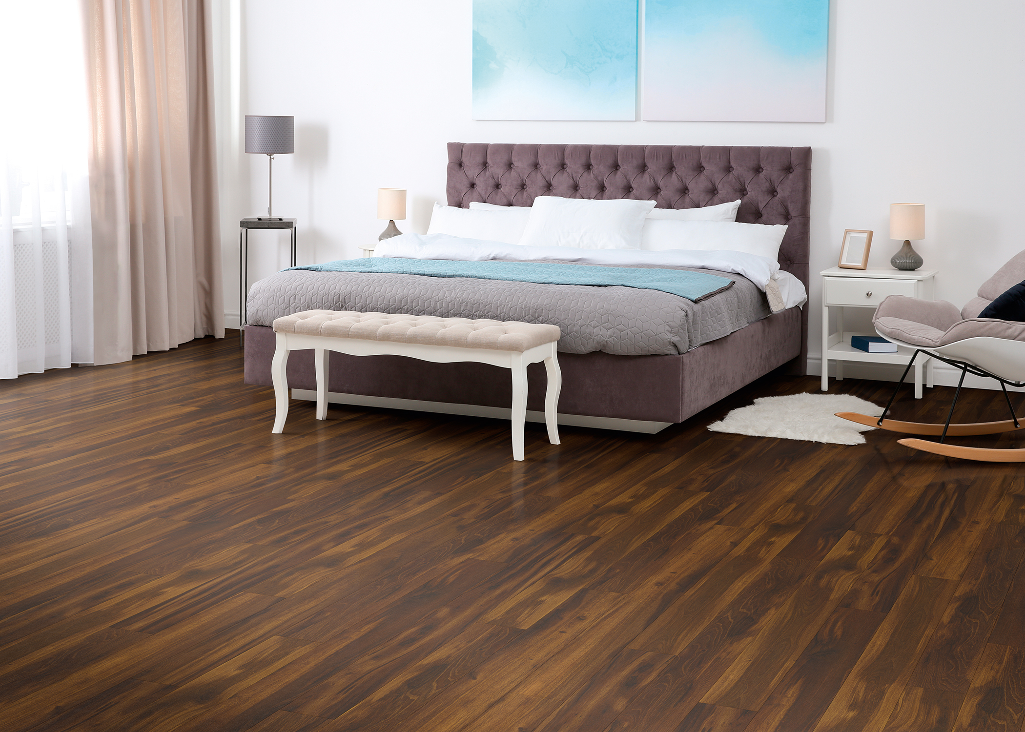
12mm+pad Roasted Chicory Laminate Flooring 6.26 in. Wide x 54.45 in. long
The other approach is through complementary colors, which sit directly across one another on the wheel, such as green and red. The powerful contrast this look provides can work to make each individual color pop, making it appear more vibrant than if it’s paired with another shade.
In Your Home
Now that we’ve laid out the basics, let’s look at how color theory can be applied to your style. If you tend to lean neutral but just want to work in a bit of color into your space, start small with things like pillows, blankets, and wall art. A little color can go a long way, and thinking smart about how you combine your decor can make a huge impact on the overall visual appeal of a room.
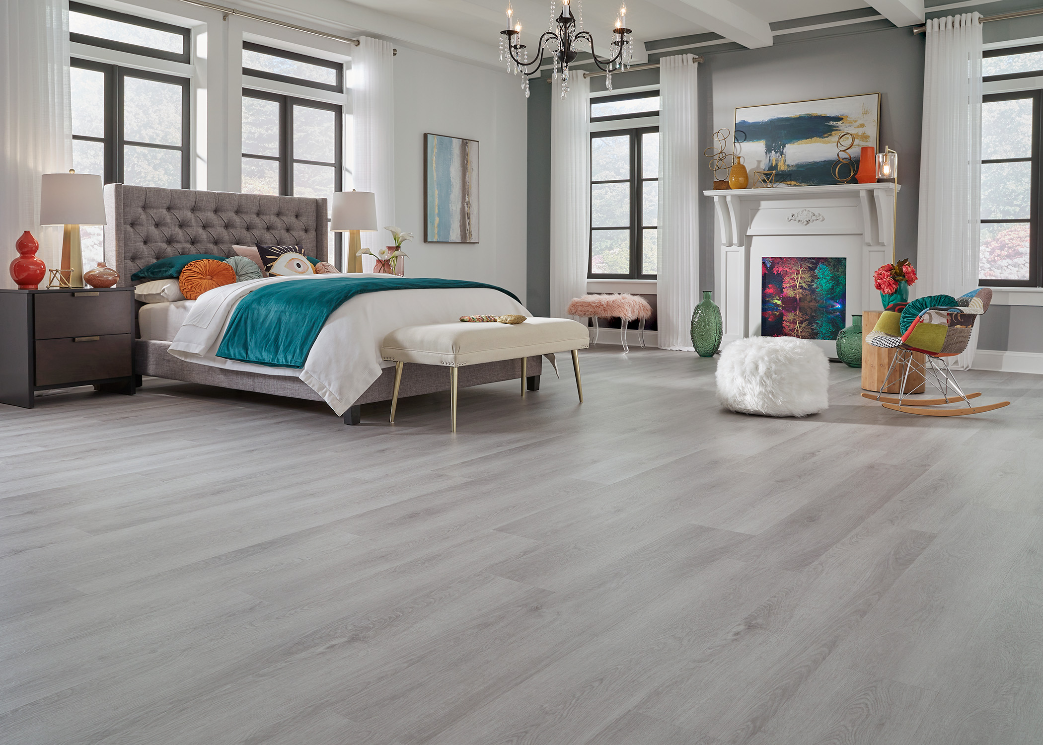
5mm w/pad Yosemite Falls Oak Waterproof Rigid Vinyl Plank Flooring 8.9 in. Wide x 60 in. Long
Playing with an analogous scheme of different shades within the same color family—dark emerald mixed in with sage, for example—can result in a rich, monochromatic look.
On the other hand, the complementary color approach can be more challenging to pull off but can pay off in timeless visual apparel. For design beginners, it’s smart to make one of these colors the dominant shade in your palette, then pepper the space with accents of the complementary color for contrast.
Once you have a solid foundation in color theory, you can go forth...making smart, stylish color choices that feel unique to your taste, whether you’re painting walls or just shopping for new throw pillows.
Post your photo on Facebook or Instagram and tag @LLFlooringOfficial for a chance to be featured on our page!
