- Home
- Inspiration
- LL Flooring Partners
- LL Flooring & Nest Out West - Guest Post by Cait Pappas
LL Flooring & Nest Out West - Guest Post by Cait Pappas
Since announcing our second pregnancy—this time around, a baby girl—my loyal Instagram followers over at @nest.out.west have been asking for all of the details when it comes to our plans for the new nursery space.
“Will you go neutral again, or..über girly?”
“Will this nursery have a similar theme to Joe’s room?”
“Will you link all of the products in a resource guide?”
Thankful for this opportunity to be a guest writer on LL Style, I wanted to share some of my favorite details of each of my sweet babies’ nurseries!

Let's START with the flooring:
We chose a water-resistant laminate Park Avenue Chevron from LL Flooring, and we couldn't be happier with this decision!
First, the price was too good to pass up, especially given the quality of this product and the durability it has shown.
We love that the wood tones mimic those found in real oak flooring products, and since the hallway outside of these two nursery spaces has an oak hardwood floor, the transition was super easy.
The tones carry well from the wide-plank oak floors in the hallway to the chevron patterned laminate floors in these nursery spaces.
As far as installation goes, it doesn't get much easier than this. The chevron pattern is already printed on each laminate plank, and the planks don't require any nails or glue to install; I'm talking floating, locking installation, and the seams are so tight once locked that nothing gets through them (24-hour AquaSeal, people)!
For more on the installation process, I put together my own little blog post with tips and tricks.


Moving on to the walls!
Wall and Trim Paint Colors:
We very recently revamped Joe’s nursery to have a look that’s more aligned with the rest of our home’s aesthetic. When we first moved here, Joe was only 2.5 months old, and I didn’t have much time between his frequent naps to paint and redecorate. Now that he’s older (two years old), I was able to take one full day while he was with his grandparents to make this mini transformation happen!
The original homeowners had painted the entire interior a very boring, neutral beige. It was a safe color to help sell the home, but from an interior decorator's perspective, all I could see were the yellow undertones in this particular beige. It looked crummy to me. After putting some new paint samples up on the wall—something I always, always recommend doing, as natural light affects your paint colors SO much from space to space—I landed on "Incredible White" from Sherwin Williams for Joe's walls and “Chantilly Lace” from Benjamin Moore for Baby Girl’s walls.
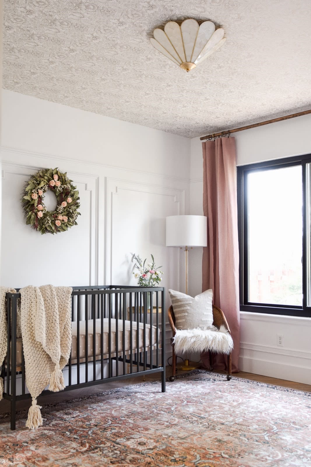
What I love about Incredible White is that it's slightly off-white, with equal parts gray and beige. It feels warm without having yellow undertones, and it has totally brightened the room. I'd say this color lives its best life when applied next to a brighter white. I had already painted the baseboards in Joe’s room using Benjamin Moore's "Chantilly Lace," which is an ultra-bright, warm white that maintains a sort of softness that gives it such great versatility, especially when applied to trim, moulding, doors, and baseboards. Since I loved this bright white so much, and the plan for Baby Girl’s room was to bring in some Art Deco-style wall paneling, I decided to make it crisp and bright by applying this color floor-to-ceiling in this space.
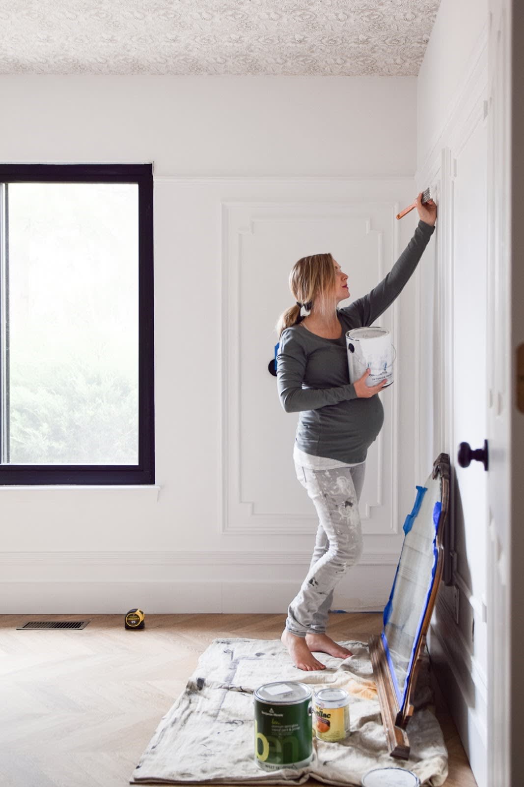
Crib Paint Colors:
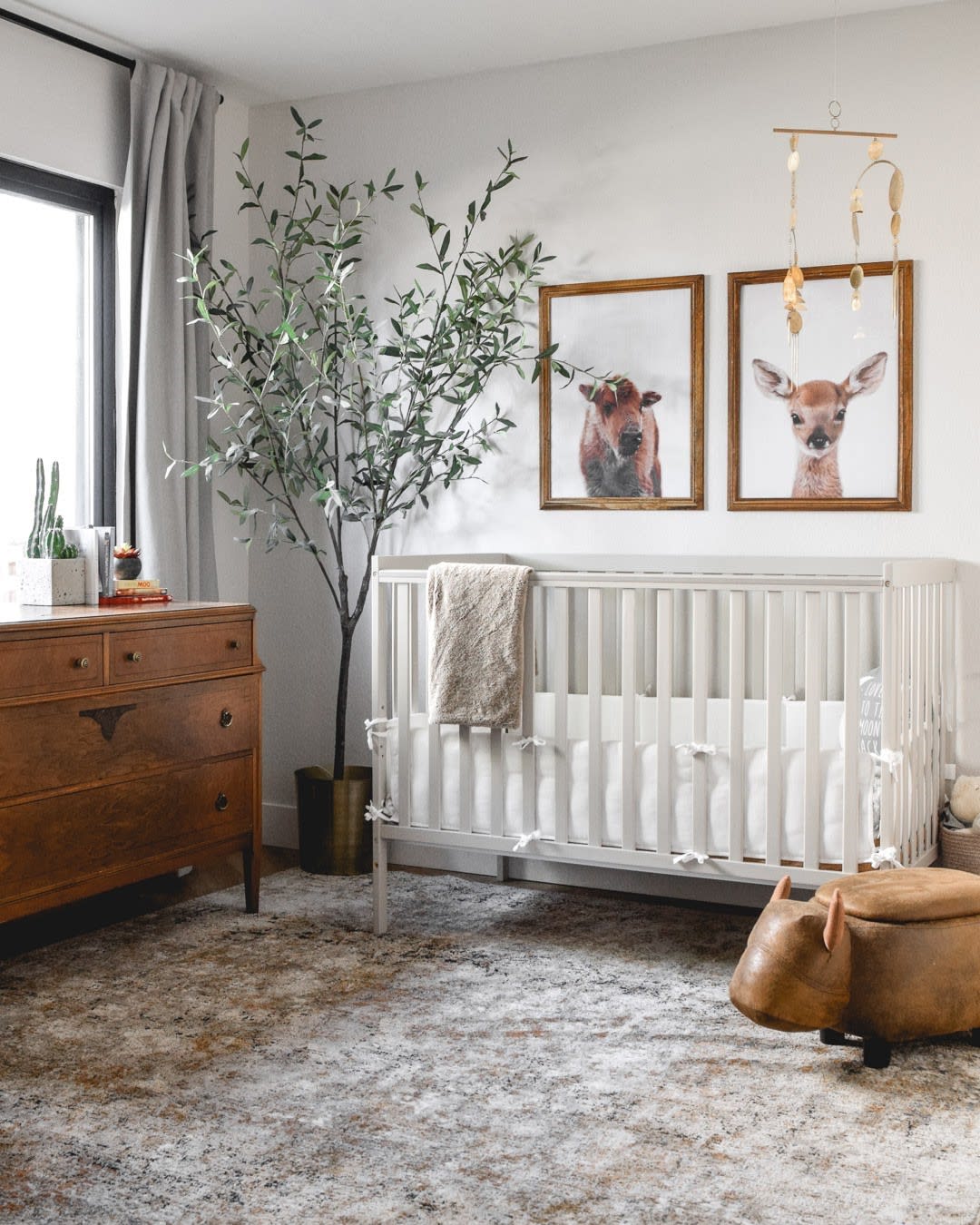
Joe's crib was a baby shower gift from my parents, and while the lighter wood tone worked really well in our first house (where the nursery had south-facing windows and loads of bright, direct sunlight), it wasn't quite hitting the same way in this house (Joe's room now has a north-facing window, so it doesn't get much direct sunlight — save a few golden hours in the summertime). I decided to lightly sand the crib and paint it so that the deeper, richer wood tones in the decor and the flooring would stand out better without having to compete with this brighter tone of wood. I actually saved money by just using one of the samples I didn't pick for the walls! That color is "Anew Gray" by Sherwin Williams, and what I love about it is that it's still a warm gray, but a touch darker than the Incredible White walls, and there's the slightest hint of olive green in the undertones. This helped it complement the antique dresser and the Charleston Frames from Hobby Lobby, as olive and chestnut are opposite each other on a color wheel.
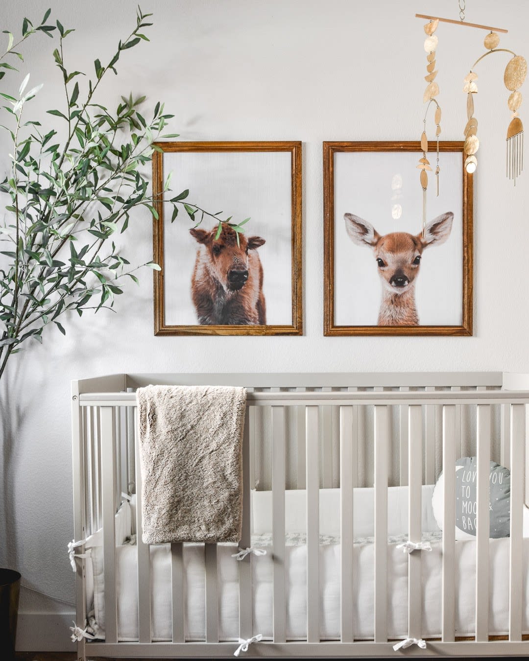
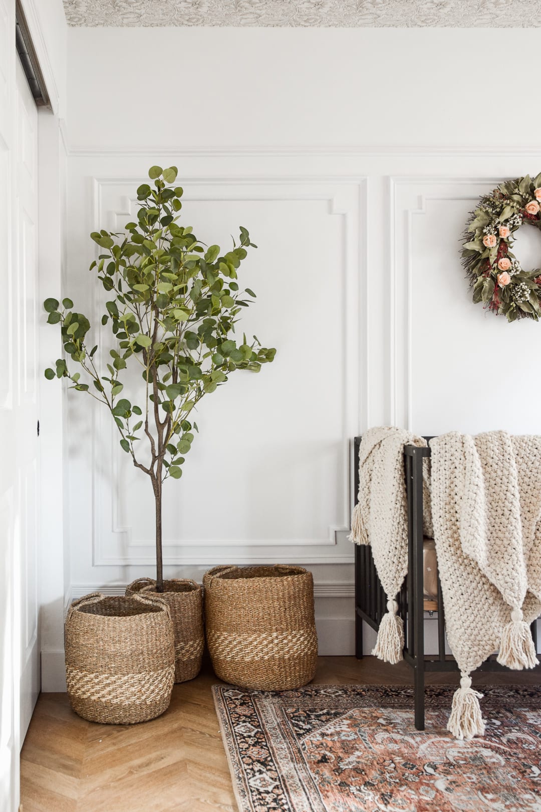
For Baby Girl’s crib, I purchased the IKEA Sniglar crib in unfinished beech for only $79(!!). Since it’s already an unfinished wood, I didn’t need to do any prep work prior to painting. I chose the darkest shade of olive green I could find to make this a high-contrast statement piece while keeping with the theme of her space (which is “Meadow,” by the way). The color I used here was Benjamin Moore’s “Fatigue Green'' in a semigloss finish.
Furniture and Decor
When we first had Joe nearly two-and-a-half years ago, I was still learning to navigate the waters of running my own e-design firm while growing my Instagram account @nest.out.west (which was originally intended to share our projects and attract new clients). My following was a fraction of the size it is now, and a lot of brands with whom I’ve had the pleasure of working this past year didn’t know who I was back then. My husband Jason and I have always been—and unless we win the lottery or something drastic like that happens to us, we likely always will be—frugal people. Most of Joe’s nursery was furnished and decorated thanks to friends and family who gifted us these items as baby shower gifts (crib, rocking chair, all of the books, the buffalo ottoman, etc.). Pottery Barn gifted us the lovely faux olive tree, and the gorgeous Theia Taupe/Gold area rug from Loloi Rugs was actually our master bedroom rug prior to this nursery revamp.
For storage, I spotted his antique wood dresser on Craigslist for only $80 when I was three months pregnant, but I knew it would be perfect for Joe’s diapers and clothing, as well as to be used as a changing table. I then purchased a few pillows, the curtains, and some cute digital downloads from Etsy to frame, and suddenly, the space felt complete.

When it came to our Baby Girl’s nursery, I have to admit, I feel like I actually did win the lottery. Brands who were now aware of my account, such as McGee & Co., Loloi Rugs, Lights.com, Christine Sweet Fine Art, Alice Lane Home, and more came forward and offered to provide furniture and decor to be used in this space.
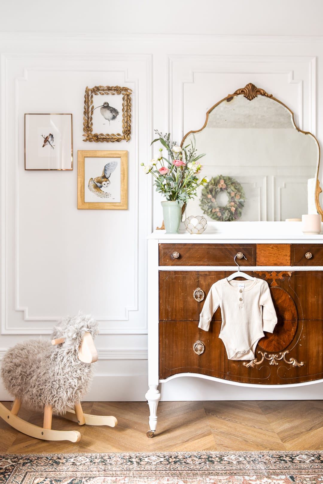
Some of these items include the wallpaper for the ceiling, the basket set, the throw blanket and pillow, the area rug, the floor lamp, the watercolor bird prints, and the upholstered rocking chair (not pictured because it’s on backorder at the moment—I’m using a $30 thrifted cane chair as a placeholder, and I have to admit, I really love how it looks in here!).
Without the generosity of these brands, there’s no way this space would have turned out to be the princess room it is today!
Aside from sponsored products, I found another antique dresser on Craigslist. This one was a bit older (built in the late 1800s) and had significantly more wear, but I could picture how pretty it would be with just a little love (and of course some primer, paint, and polish!). This one was $140 on Craigslist. My mother-in-law saw how much I loved it, and even though I wasn’t yet pregnant with our second child, she bought it for me as a birthday gift. We both figured I could always refinish it and sell it if we weren’t blessed with another successful IVF pregnancy. I must say, though, now that I’ve glammed-up this piece with some primer, paint, polish, and some antique gold Rub ‘n’ Buff, it couldn’t be more perfect for our sweet daughter’s nursery! Look at how it pulls the darker tones up from the Park Avenue Chevron flooring, too—I love it!
Looking for Product Links?
Head over to my blog to find a dedicated blog post taking you on a tour of each of these two nurseries. There, you’ll find exact product links to everything I chose to fill and decorate each room! Did I miss anything? Feel free to leave your questions in the comments there, and as soon as I see them, I’ll reply as best I can!
Thanks for your interest in our home! For continued updates, be sure to follow us on Instagram @nest.out.west!
Hugs,
Cait
About Cait
Cait Pappas is founder of Nest Out West, a Denver-based interior decorating and e-styling small business that focuses on bringing value to her clients’ homes by sourcing beautiful but affordable furniture and decor and by recommending budget-friendly DIYs.
Cait is also an influencer in the interior decorating niche on Instagram, where she shares ideas and inspiration to upgrade and update her family’s 1999 builder-grade home.